Align-content, align-self, align-items, justify-content, justify-self, justify-items, place-content, place-items, place-self, text-align, vertical-align… Confused yet? And it feels like there are a hundred more. Time to add some logic to what seems to be a proliferation of CSS alignment declarations.
There are many layout concepts and you can use more than one to achieve the same thing. This article demonstrates how to create Flexbox alignments with Tailwind. As a side note; I use React’s className attribute instead of HTML’s class in the examples.
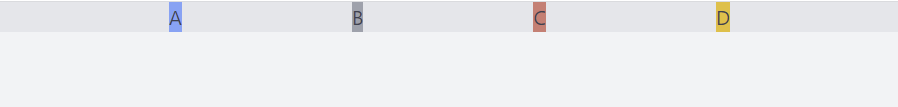
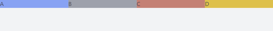
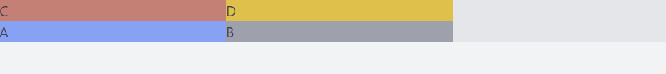
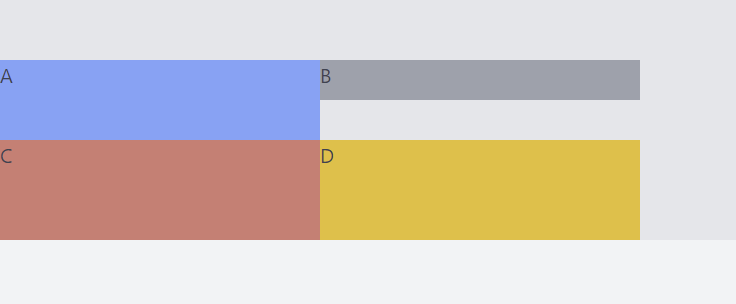
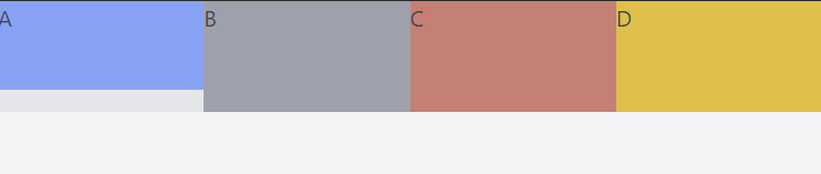
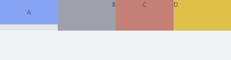
Specify flex on the container…
<div className="flex bg-gray-200">
    <div className="bg-blue-400">A</div>
    <div className="bg-gray-400">B</div>
    <div className="bg-red-400">C</div>
    <div className="bg-yellow-400">D</div>
</div>
and we get:

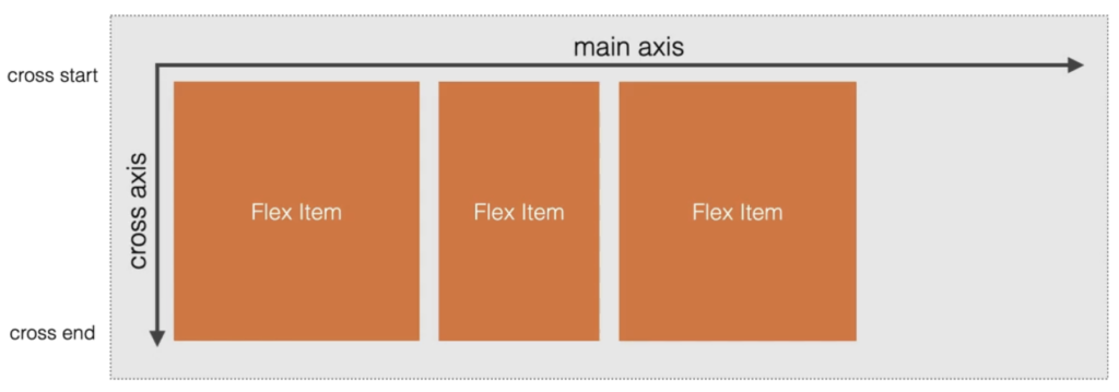
Conceptually every flexbox container has a main axis and a cross axis:
- By default the flex-direction is
flex-row, meaning the main axis is horizontal and the cross axis vertical - If you specify
flex-colon the container then the main axis is vertical and the cross axis is horizontal - Also
flex-col-reverseandflex-row-reverseexist
Overview over Tailwind’s alignment classes for flex layout
There are different places where alignment can happen:
- On all items within the flex container
- To align items along the container’s main axis use
justify-classes - To align items along the container’s cross axis use
items-classes
- To align items along the container’s main axis use
- On the rows or columns within the flex container
- To align whole rows or columns of items use
content-classes
- To align whole rows or columns of items use
- On an individual item within the flex container
- To align individual items along the container’s cross axis use
self-classes
- To align individual items along the container’s cross axis use
- On the content of an individual item
- To align the content of an individual item you make it another flex container and use the classes above
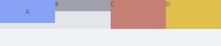
Aligning items along the main axis (justify-classes)
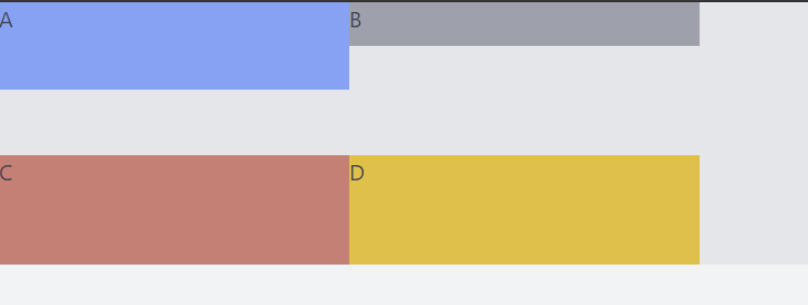
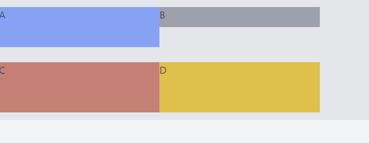
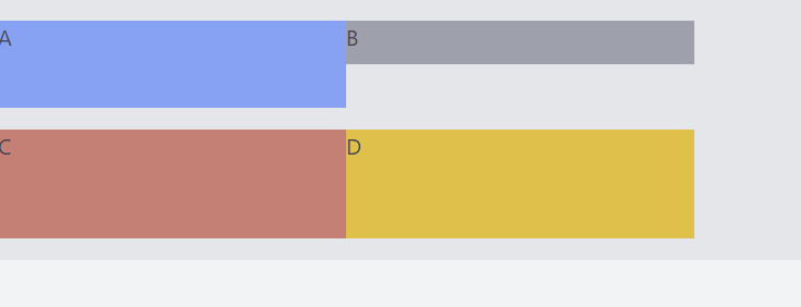
Adding one of the following Tailwind classes on the flex container will align the items:
- justify-start (default, can be omitted)
<div className="flex justify-start bg-gray-200">
    <div className="bg-blue-400">A</div>
    <div className="bg-gray-400">B</div>
    <div className="bg-red-400">C</div>
    <div className="bg-yellow-400">D</div>
</div>

- justify-end
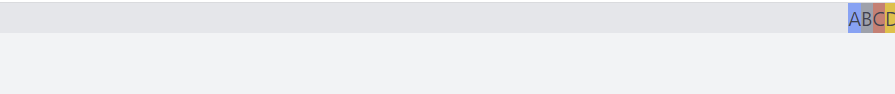
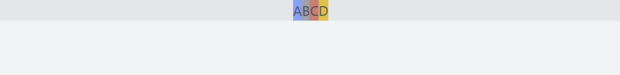
- justify-center
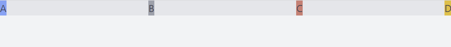
- justify-between
- justify-around

- justify-evenly
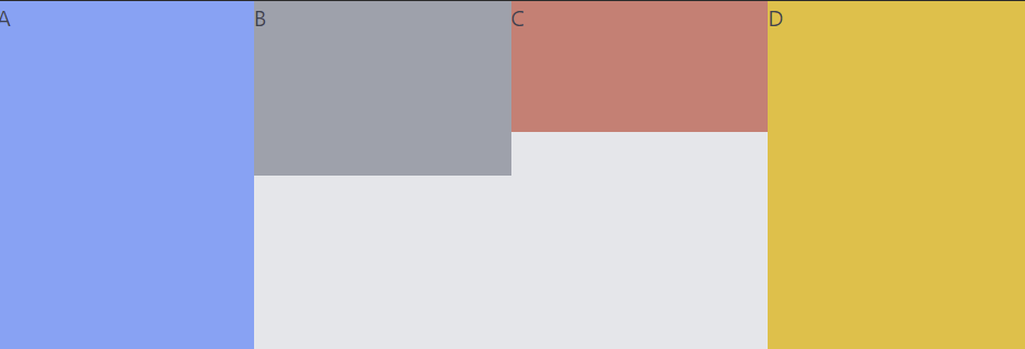
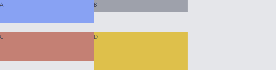
Align items along cross axis (items-classes)
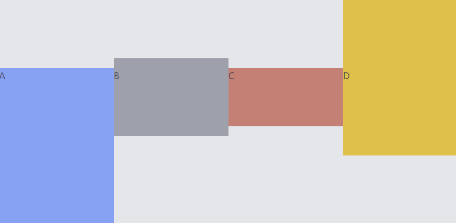
- items-start (default, can be omitted)
<div className="flex items-start bg-gray-200">
    <div className="bg-blue-400 w-64 h-64">A</div>
    <div className="bg-gray-400 w-64 h-32">B</div>
    <div className="bg-red-400 w-64 h-24">C</div>
    <div className="bg-yellow-400 w-64 h-64">D</div>
</div>
- items-center
- items-end
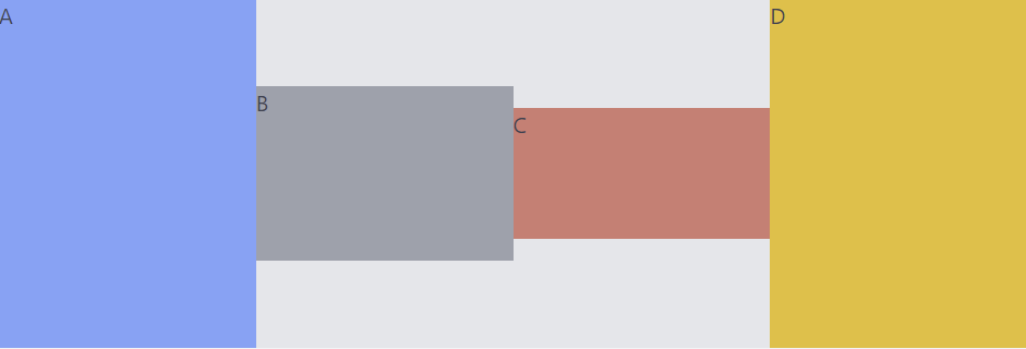
- items-baseline
To show the effect of baseline we add padding to some elements:
<div className="flex items-baseline bg-gray-200">
    <div className="bg-blue-400 w-64 h-64">A</div>
    <div className="pt-4 bg-gray-400 w-64 h-32">B</div>
    <div className="bg-red-400 w-64 h-24">C</div>
    <div className="pt-28 bg-yellow-400 w-64 h-64">D</div>
</div>
As you can see, baseline means that the content of the items (the letters) stay aligned:
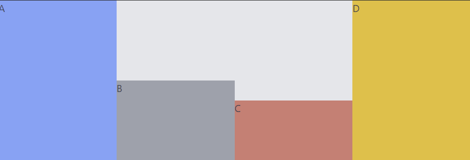
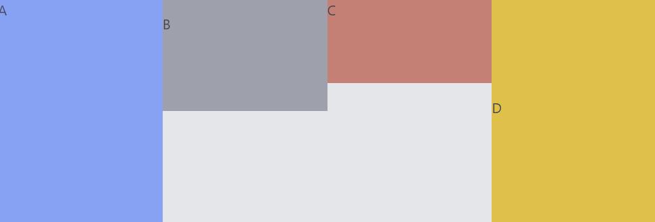
- items-stretch
We give B a top margin, C a top padding and for D we do not specify a height:
<div className="flex items-stretch bg-gray-200">
    <div className="bg-blue-400 w-64 h-64">A</div>
    <div className="mt-4 bg-gray-400 w-64 h-32">B</div>
    <div className="pt-8 bg-red-400 w-64 h-24">C</div>
    <div className="bg-yellow-400 w-64">D</div>
</div>
Because D has no height specified it stretches along the cross-axis to the same height that the longest element has, in this example A. B and C have a height specified and thus do not stretch.
Wrapping
By default flex items don’t wrap if there is not enough space for them to be displayed (class flex-nowrap by default), instead they shrink:
<div className="flex bg-gray-200">
    <div className="bg-blue-400 w-64">A</div>
    <div className="bg-gray-400 w-64">B</div>
    <div className="bg-red-400 w-64">C</div>
    <div className="bg-yellow-400 w-64">D</div>
</div>
Adding flex-wrap to the flex container makes them wrap:
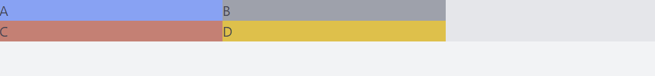
There is also flex-wrap-reverse. What would normally wrap below, is now wrapped above:
Align whole rows or columns (content-classes)
Aligning whole rows or columns makes most sense if you have many rows or columns. Therefor we use flex-wrap. We also specify the height of the flex container, so we can see how the rows or columns align in reference to the flex container:
<div className="h-48 flex flex-wrap bg-gray-200">
    <div className="bg-blue-400 w-64 h-16">A</div>
    <div className="bg-gray-400 w-64 h-8">B</div>
    <div className="bg-red-400 w-64 h-20">C</div>
    <div className="bg-yellow-400 w-64">D</div>
</div>
By default, if do not use any content-classes:
Notice that the light gray box is the flex container. All items align to it:
- content-center
- content-start
- content-end
- content-between
- content-around
- content-evenly, a very subtle difference to content-around in this example
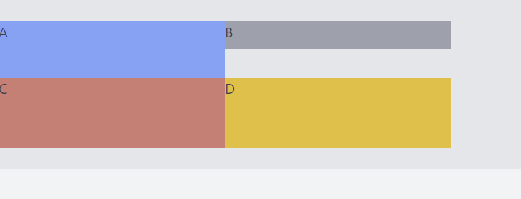
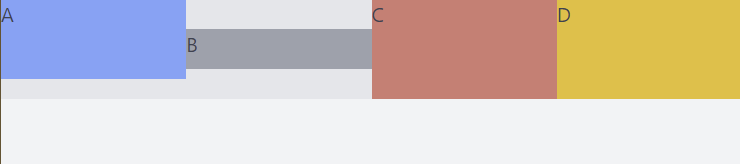
Align individual items along a container’s cross axis (self-classes)
self-auto(default, can be omitted)
<div className="flex bg-gray-200">
    <div className="bg-blue-400 w-64 h-16">A</div>
    <div className="bg-gray-400 w-64 h-8 self-auto">B</div>
    <div className="bg-red-400 w-64 h-20">C</div>
    <div className="bg-yellow-400 w-64">D</div>
</div>

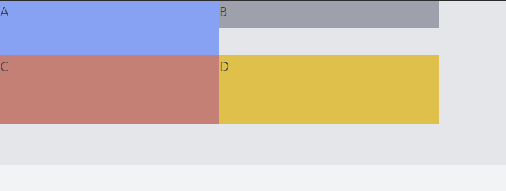
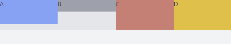
- self-end
Here we align B to the end of the cross axis:
<div className="flex bg-gray-200">
    <div className="bg-blue-400 w-64 h-16">A</div>
    <div className="bg-gray-400 w-64 h-8 self-end">B</div>
    <div className="bg-red-400 w-64 h-20">C</div>
    <div className="bg-yellow-400 w-64">D</div>
</div>

self-start
self-center
self-stretch
To make this work we remove the specified height on B:
<div className="flex bg-gray-200">
    <div className="bg-blue-400 w-64 h-16">A</div>
    <div className="bg-gray-400 w-64 self-stretch">B</div>
    <div className="bg-red-400 w-64 h-20">C</div>
    <div className="bg-yellow-400 w-64">D</div>
</div>
Align content of individual item
We want to align A so it is centered horizontally and vertically like so:
To achieve this we don’t need any new class, instead we specify a flex container on A and use the already known classes:
<div className="flex bg-gray-200">
    <div className="bg-blue-400 w-64 h-16 flex items-center justify-center">A</div>
    <div className="bg-gray-400 w-64 flex items-start justify-end">B</div>
    <div className="bg-red-400 w-64 h-20 flex items-baseline justify-center">C</div>
    <div className="bg-yellow-400 w-64">D</div>
</div>
About Author

I am Mathias from Heidelberg, Germany. I am a passionate IT freelancer with 15+ years experience in programming, especially in developing web based applications for companies that range from small startups to the big players out there. I create Bosycom and initiated several software projects.