CSS provides (at least) two ways to set elements in motion: transitions and animations.
Transition vs animation
Choose transitions if
- you only want something to happen once and
- if you only transition one or two properties in a given state
The positive effect: Even if transitions should not be supported in a browser, the end result – without the motion – will be displayed anyway. Be aware, that there are certain properties that can’t be transitioned (e.g. display). Here is a list of animatable CSS properties on MDN.
Choose animations if
- you need to loop infinitely or repeating a specific amount of times
- you need to change a number of properties at certain keyframes
Animations are self starting and don’t require a trigger like a transition does. Animations can alternate between start and end state.
Transitions
A transition describes how a property should display its change when given a different value. In the following example we create a Simple CSS transition.
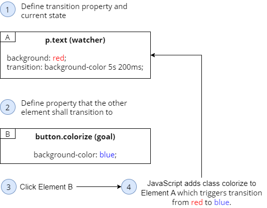
Step 1: Create element that you want to transition
<p class="text">Hello there</p>
Step 2: Define CSS rule #1 (watcher rule)
I call this the “watcher rule”, because transition watches for changes of a specific CSS property on our element. Those changes are later triggered by rule #2. This also makes it easier (at least for me) to remember where to set the transition CSS property.
Transition property on an element asks: “Hey dev, which property (or properties) should I watch out for, so that I can transition it later on?”
Our element’s background-color will start as red and shall later transition its background color over 5 seconds with a 200ms delay using a ease-in timing function.
.text {
  background-color: red;
  transition: background-color 5s 200ms;
}
or here the same but more verbose version:
.text {
  background-color: red;
  transition-property: background-color;
  transition-duration: 5s;
  transition-delay: 200ms:
}
You would define multiple properties like this:
  transition:
    color 2s,
    background 5s;
You can use all to watch for changes on all properties of an element, but you should avoid using all because of its poor performance:
transition: all 5s;
Step 3: Define CSS rule #2 (goal rule)
Here we define to which value our element’s background color will transition to. In our example blue. In fact this CSS rule is completely transitions-agnostic. It looks like any non-transitioning CSS rule. But together with rule #1 it has an important role: Setting the goal of the transition.
.colorize {
  background-color: blue;
}
Step 4: Trigger the transition by adding the CSS class of rule #2
To trigger this transition on a target element you have to add the CSS class defined above to that target element.
window.onload = function() {
  document.getElementsByClassName("text")[0].classList.add("colorize");
}
Quick question to check your understanding: To trigger our background-transition we had to write two CSS rules: .text and .colorize. In which of those did we specify the transition CSS property again? Rule #1 or #2? Which one is watching and which defines the goal?
250 to 300ms seems to be the optimal duration for most animations. A rule of thumb: The bigger the element and the longer the way it needs to travel on screen, the longer the duration should be (“Moving large elements super quick does not look good on screen”).
Timing functions
Easing (also known as “cushioning”) describes an animation’s rate of change. That means you can use timing functions to tweak animations in a way that they start fast and end slow for example.
ease-in is acceleration. ease-out is decelerating. Then there is a combination: ease-in-out. And then there is linear.
Replace the word “ease” with “slow” to better remember the timing effect. Ease-in becomes “slow in”.
Custom timing functions
…can be achieved with cubic-bezier. Make your own on cubic-bezier.com.
.cube {
  width: 50px;
  height: 50px;
  background-color: red;
  transition:
    transform 4s cubic-bezier(.21,1.04,.51,.37);
}

.move {
  transform: translate(200px);
}
Animations
Step 1: Define the element
… that is supposed to be affected from the animation:
<div class="cube"></div>
Step 2: Create animation using keyframes
.cube {
  background: green;
  width: 50px;
  height: 50px;
}

@keyframes alchemy {
  0% {  background: purple }
  100% {  background: gold }
}
or you could write the equivalent notation using from and to:
@keyframes alchemy {
  from {  background: purple }
  to {  background: gold }
}
Step 3: Create CSS rule using the animation
Wait 200ms then start the animation of name “alchemy”, run it for 1 second in a linear progression 2 times.
.alchemy-animation {
  animation: alchemy 1s 200ms linear 2;
}
Or the equivalent verbose notation:
.alchemy-animation {
  animation-name: alchemy;
  animation-duration: 1s;
  animation-timing-function: linear;
  animation-iteration-count: 2; /* defaults to 1. Can be infinite*/
  animation-delay: 200ms;
}
Step 4: Assign animation rule from previous step
window.onload = function() {
  document.getElementsByClassName("cube")[0].classList.add("alchemy-animation");
};
The result will be: Green for 200ms, purple to gold in 1 second, then again purple to gold in 1 second, then green.
Using multiple values
From black to gold with round borders and back to black:
@keyframes alchemy {
  0%, 100% {
    background: black;
  }
  50% {
    border-radius: 50px;
    background: gold;
  }
}
Multiple animations
From black to gold in 5 seconds, then an infinite blue -> red -> blue. Note, that on police we chose a delay that is as long as the duration of alchemy (5 seconds), so the two animations don’t interfere:
.alchemy-animation {
  animation:
    alchemy 5s 200ms linear 2,
    police 1s ease-out infinite 5s;
}

@keyframes alchemy {
  from {
    background: black;
  }
  to {
    background: gold;
  }
}

@keyframes police {
  0%, 100% {background: blue;}
  50% {background: red;}
}
Using Steps for a flick book animation
A flick book is made out of many similar images, each on its own page – most often a little drawing. If you flick fast enough through the pages then it looks like you are watching a little movie. Or in other words: A sequence of frames, an animation.
We can recreate that simply with CSS using steps(x), which is a timing function. X is the number of frames you want to have in the animation.
Instead of a flick book with many separate pages, you have a single image file (sprite_horse_running.png) containing 12 separate illustrations stacked on each other. That is called a Sprite image.
In this example each illustration has a height of 200px. The challenge is to create an animation that positions the background of the Sprite in a sequence of steps using the step(x) timing function. Here is the solution:
<div class="horse-running"></div>
.horse-running {
  background: url(https://foo.org/sprite_horse_running.png) 0 0 no-repeat;
  height: 200px;
  width: 400px;
  margin: 100px auto 0;
  animation: run 1s steps(12) infinite;
}
@keyframes run {
  0% {
    background-position: 0px 0px;
  }

  100% {
    background-position: 0px -2400px;
  }
}
A more performant flick book animation
Since background-position is not very performant (it triggers many repaint and layout processes) we can use translate() instead:
<div class="horse-running">
  <img src="http://stash.rachelnabors.com/animation-workshop/sprite_catwalk.png" alt="" />
</div>
.horse-running {
  height: 200px;
  width: 400px;
  position: absolute;
  top: 50%; left: 50%;
  transform: translate(-50%, -50%);
  overflow: hidden;
}

img {
  animation: walk-cycle 1s steps(12) infinite;
}

@keyframes walk-cycle {
  100% {
    transform: translate(0, -100%);
  }
}

p {text-align: center;}
Fill modes
An animation with default settings disappears after its animation ended (after 100% keyframes are played). Additionally, an animation would not display its first frame (0%) before it actually started. You can change that by using animation-fill-mode with
backwards: the animation shows the first frame even if it did not start yet (because of an animation-delay)forwards: the animation shows the last frame even after its endboth: the animation has behavior ofbackwardsandforwards
.cube {
  width: 50px;
  height: 50px;
}

.alchemy-animation {
  animation-name: alchemy;
  animation-duration: 2s;
  animation-delay: 5s;
  animation-fill-mode: forwards;
}

@keyframes alchemy {
  from {
    background: black;
  }
  to {
    background: gold;
    border-radius: 30px;
  }
}
Play state and direction
animation-play-state is running by default. But it can also be paused.
animation-direction defaults to normal, but it can be set to alternate (0% to 100% then on 2nd iteration from 100% back to 0%), reverse (100% to 0%) and alternate-reverse (100% to 0% then on 2nd iteration from 0% to 100%).
Stateful animations
You can categorize animations in 3 types, based on how much input they need to render the animation:
- Static animations: They just start and end without taking user input into consideration during the animation
- Dynamic animations: They are rendered based on dynamic input such as mouse movements from the user or database requests
- Stateful animations: They are a mix of static and dynamic animations, that is: you still declare animation via CSS statically, but you also use dynamic input via JavaScript.
How are animation states triggered? Without JavaScript you are restricted to what CSS gives you, e.g. hovering over an element using something like div:hover. Other triggers are loading events, scrolling, clicking, timeouts.
Fade out transition
First we show a div.loader, then after 2 seconds the element disappears and .content fades in for 3 seconds.
<body>
<div class="container loading">
  <div class="loader">Loading...</div>
  <div class="content">Here I am !</div>
</div>
</body>
.content {
  transition: opacity 3s;
}

.loading .content,
.loaded .loader {
  opacity: 0;
}
window.onload = function() {
  window.setTimeout(function() {
    $(".container").removeClass("loading").addClass("loaded");
  }, 2000);
}
Chaining Animations with Event Listeners
The events are animationstart, animationend, animationiteration (after reaching 100% in each iteration), transitionend (when transition has completed). There is no transitionstart event by the way. Caution: They will fire for every animation or transition on the element, so write JS to detect the right one you need.
$("#animated-thing").on("animationend", function(evt) {
  if(evt.originalEvent.animationName === "my-animation-name") {
    $(this).addClass("animate-something");
  }
})
Browser rendering process
Every browser has to render/display your HTML eventually. That happens in a 3 step process:
- Layout process: Calculates where all the elements are positioned at which height, width and so on.
- Paint process: Individual elements are painted, sometimes using the GPU.
- Composite process: The painted elements are pasted into the layout.
Some CSS properties cause all three processes to run, some only one or two of the processes. On csstriggers.com is an overview that shows which CSS property is causing which process to run.
The two CSS properties considered most performant are opacity and transform. There are also some handy alternatives:
Instead of transform: width (or height) use transform: scale().
Instead of transform: position use transform: translate().
Instead of z-index or visibility: hidden use opacity.
Letting the browser know in advance what will change
You can tweak/optimize your animations (at least Chrome, Firefox, Safari and Opera) by letting the browser know which property you are going to animate. That’s where the CSS property will-change comes into play.
In this example we tell the browser: “Hey, optimize the transform on our .animated-thing element, because sooner or later the user triggers the animation by hovering over it.”
.in-view .animated-thing {
  will-change: transform;
}

.in-view .animated-thing:hover {
  transform: translateY(15%);
}
Chrome Dev Tools for more insights
Open the Chrome Dev Tools with F12. Add tabs for animations and rendering by clicking on the three dots next to “Console”.
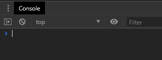
From here you can do all kind of nice debugging stuff, such as slowing down animations, showing the frames per second and areas that are affected from repainting and layouting – very useful for performance tweaking.
Don’t animate it if it isn’t visible.
About Author

I am Mathias from Heidelberg, Germany. I am a passionate IT freelancer with 15+ years experience in programming, especially in developing web based applications for companies that range from small startups to the big players out there. I create Bosycom and initiated several software projects.